Monday 28 September 2009


This is my final contents page, I have followed the conventions of a contents page to make it successful. I have used the same colour scheme as my front cover so that they matched, and they are the colour scheme of school. I have included bold sub headings, and also page numbers. It was difficult finding a photo to suit my front cover as I wanted it to link in with one of my stories. I also did not want to have to cut it out because the model's hair would have been very awkward. It was hard to get the camera angle of this photo right as I had to take it in mid-air.

This is my final magazine cover. I have followed the main conventions of magazines to create it. For example I have included attractive models, a bar code, and tags. The photo angle that I decided to use is a medium close up, this is because it is a typical magazine convention. I also made the models look directly into the camera, as if they are staring at the reader. I think that the models clothing stands out well against the blue background.

Once I had cut around my photo I transferred it onto the background. I choose to have a blue and yellow colour scheme as they are the school colours. I used the same font for all of my text so that it did not look uneven. I also added a shadow or outer glow to my text to make sure it stood out on the blue background. I decided to add a bar code to my magazine as this is a typical convention of a magazine.

Wednesday 23 September 2009


Once I had took all of my photos I started to design my front cover. The first thing I did was cut out my picture.
This was quite difficult as I had to create a neat, outline around the image. After this I transferred the image onto my magazine background.
When I created my school magazine, the first thing I decided to do was go and take pictures. This meant that I had the foundation to my magazine. I took a range of photos as this meant I had lots of option choices, and had back up photos incase they didn't look as they appeared on the camera screen.


This was the very first photo that I took, althought I liked how the background complimented the models clothing, the male model looked too serious. Therefore I chose not to use this photograph.


My next idea was to have someone jumping in the air on my cover, as if they were celebrating good results. However, it was difficult to get the position of the camera right, and to capture a high quality image in the air. I decided not to use this idea, as all of the photo's were too blurry, or difficult to cut out.


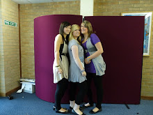
This is the photo that I finally decided to use. I choose this,
as both of my models l ook natural and are both staring
into the camera.