For my media product I worked alone to create five pages: a front cover, contents page, a double page article and an additional single paged article. To make my product more realistic I analysed a number of magazines already on the market, and looked at a range of conventions that they use to make a successful product. For my front cover I used an issue of ‘VIBE’, an urban music magazine, as my inspiration.
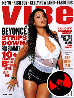
I used the same colours on my front cover as used in this issue of ‘VIBE’: red and black. This magazine uses ideology of the patriarchal society which promotes the cultural value system, and this is why they have used a sexually attractive female. I also decided to make some of the writing white so that it would stand out on a black background and I used a white background to make everything on my front cover stand out.
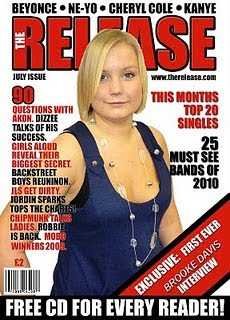
My front cover uses many conventions of a real life product because there is one main image; I have used a medium shot of an attractive model that is looking directly into the camera, like ‘Vibe’ hooks to stories inside; a barcode; a menu bar across the top of the page; a free gift to attract a wider audience and I have included a website. I have only used three colours for text so that it doesn’t look overcrowded, I have only used two different fonts and I have justified the text down the left of right side in order to make my front cover look like a real magazine. I decided to name my magazine ‘The Release’ because it is based on chart music and the latest musical ‘releases’ into the chart. I have used the ‘bevel and emboss’ effect on Photoshop on the title to make it stand out on the page. I have also added a drop shadow to the text on the right hand side to make it seem like it is jumping out of the page. I decided to use a different font for ‘Brooke Davis’ so that it is obviously noticeable that this is the main feature of the magazine. I also cropped the photograph using Adobe Photoshop.
Contents page

This is the final draft of my contents page which looks similar to those already on the market such as ‘Blender’ and ‘Vibe’ for a number of reasons. Firstly, I have used the same colour scheme as my front cover, and have included the title of my magazine on the page. I have separated my text into three sections: on the cover, inside and regulars. This ensures that it easy to find stories from the hooks on the cover or anything else in the magazine. I have included an editor’s note, as this is also a common feature on a contents page and have added an additional section on my main feature including an extra photograph. I have added page numbers on top of the photographs so that it is easy for the reader to find the article that relates to the picture. The page numbers are a slightly bigger size and a different colour so that the layout is clear and structured, and are organised in chronological order. I have also desaturated the editor’s letter photograph to make it black and white as it has connotations of style and differentiates it from other photographs on the page. To make my main article image appear to be jumping out of the page, I added a drop shadow to it using photoshop.
Main Article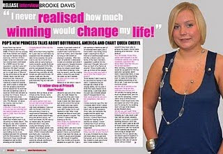
When I created my article I decided to use an article from ‘Star’ magazine as my style model, although this isn’t a music magazine I liked the layout of the article as it had a question and answer layout. It follows the conventions of genuine magazines as I have kept the same colour scheme on all three pages, and have extracted a quote from the interview to use as the title. My model is looking directly into the camera and I have used a medium shot. I have included the name of the magazine

in the top left corner to promote a house style that the readers will recognise and have also stated who the interview is with so it is easily recognisable. I have included the issue number and page number along the bottom as well as writing the credits for the photograph up the left hand side of the page, as this is also a common convention. The photograph of my model also takes up almost half of a page and I have included a headline to attract the audience. On the second page I have also wrote a caption for each photograph, and have extracted another two quotes from the interview to use on each page. I decided to write a question and answer style interview and have split my writing into columns, as this is a common convention of an article/feature layout. The text is also justified down the left hand side, and the questions and answers are in different colours so that it is easy to read. In addition I have mentioned who the article was written by, and wrote a brief section of information on what is currently happening for my celebrity. I have included an introductory paragraph and the first letter of my article is bigger as this is a common feature of a magazine. I think that my magazine helps to promote the theory of ideology because I have used an attractive model, which helps to promote the cultural values system of the patriarchal society that we live in to my audience.
How does your media product represent particular social groups?
My target audience are females aged 15 – 25 and I think this is the age when young women look for guidance from celebrities and this is why I decided for my ‘celebrity’ to fit into the same age category. I have aimed my magazine at working and lower middle class women. I think that my article is inspirational as my celebrity has had a damaged past which has seen Brooke battle a drug addiction. However, she has overcome the problem and has won the X Factor, proving that people can turn their lives around. I think this helps to prove to the audience that anything can happen as long as you focus on your dream, and don’t let anything ruin what you believe in. Since I have shown a female in a positive light this helps to prove that she has battled the sexism of the music industry and is now living her dream. I think my article shows the reader that no matter what background you come from nothing can hold you back. There is also a lot of pressure from the media making girls think they have to look too skinny or be air – brushed in order to be successful. I have used an attractive, normal woman to prove that you don’t have to live up to the pressure and expectations of the music industry in order to be famous. My article also helps to prove that women can be successful in a society dominated by men, and since she is from a working class background, this proves that anyone can achieve success.
What kind of media institution might distribute your media product and why?
I think a media institution such as Bauer Media would distribute my media product,
http://www.bauermedia.co.uk/, as it is home to the most influential multi-media brands in the UK, such as ‘Q’. It is a very established brand, which would aid me in distributing my magazine to major outlets and smaller retailers.

Although the majority of magazines that this company distributes are gossip magazines, I think since my magazine is aimed at a young female audience Bauer would hold quite a big influence on 15 – 25 year old women. Therefore a music magazine that features lifestyle stories would help to attract a broader demography, as it has never been created before. ‘Q’ is constantly moving more towards being a lifestyle magazine, although it still foregrounds music. It is constantly changing which reflects the need for diversification to reach a larger audience. This would benefit the company as it would help to attract a wider audience to their other magazines on the market as well, which would help to increase their profits. Although my magazine is similar to ‘Blender’ and ‘Vibe’ these are American magazines and therefore do not feature on British shelves I think that my magazine would be placed in between music magazines such as ‘NME’ and celebrity magazines such as ‘Star’ as this is the audience that I am trying to attract; music loving women. I think my magazine would compete with a wide range of magazines as it combines a music magazine with a stereotypical women’s magazine therefore these will be the major competition. Generally, there are not many music magazines aimed at women aged 15 to 25 so I am targeting a niche audience, but to broaden its appeal I have included life style elements.
What would be the audience for your media product?The target age for my magazine is women aged between 15 and 25. I decided there were no other British music magazines which specifically targeted this audience and that are why I aimed my media product at them. I also chose to aim it at working and middle class women as these are most likely to buy magazines and my articles may be inspirational to them, as they prove that no matter where you can come from, you can achieve your dream, and this was the audience my research proved buy more magazines. I decided to interview a large selection of women aged 15 – 25 to ask them their opinions on my magazine. Here are two women that I have selected from my interviews:
Profile OneName

: Jennifer Dinning
Age: 18
Occupation: Student with a part time waitressing job.
Lives: In Liverpool, with her parents
Monthly Income: Around £200
What do you normally spend your wages on? Normally I spend quite a lot of my wage on clothes or gig tickets. I also spend around £30 a month downloading music on iTunes.
Aspirations: I’m really into photography and filming so I’m hoping to make my way into the media business.
What kind of music do you download? I like a bit of everything, so for me the top 40 chart is the best thing to download. It has loads of different genres so there’s something to suite every mood I’m in which is why I love it.
I then showed Jennifer my media product and asked her opinion on it.
‘I think it looks really professional. It looks like a lot of magazines already on the market but I love how it’s a music magazine. I’ve been waiting for one like this to come out for ages, other than American magazines there isn’t any majorly aimed at women. I also love the genre of music it contains because the chart has something for everything, plus it changes all of the time which makes it a lot more exciting! I definitely would buy this magazine if I saw it, plus it’s very reasonably priced.’
Profile Two
Name: Emma Swaddle
Age: 21
Occupation: Student at Durham University, weekend and evening job in a bar.
Live: In student accommodation at Durham University.
Monthly Income: I normally make around £400 but I also get tips so sometimes it’s anything up to £600!
What do you normally spend your wages on? Well after paying for my accommodation, I still normally have quite a lot left but I go to town at least three times a week and I spend some of it on going out to gigs or saving to go to festivals. Last year I went to the Top 40 festival in Reading and it was amazing! It featured all of the top 40 artists from 2008’s chart and the atmosphere was incredible. I love the charts as it continuously changes so you never get bored of it, plus it features loads of different genres of music. I’ve also just bought a new iPod so I’ve spent a lot of money downloading songs for it. It’s so much easier than having top buy CDs - and much cheaper!
Aspirations: I’m currently studying English at University so I’m just going to see where it takes me.
I then showed Emma my final media product and asked her opinion.
‘I love how for once it’s aimed at women! Normally music magazines are largely aimed at men so I don’t buy them but this is perfect! I love how the cover isn’t too girly so that it just appeals to stereotypical girly women, it appeals to all women! I think it looks like an actual magazine already on the market but the genre of music really appeals to me! I also like how the main article is inspirational and I love the X Factor so it’s everything I’ve been looking for. I would definitely buy it.’
How did you attract/address your audience?
To attract my audience I decided to carry out a questionnaire to find out what my target audience wanted in a music magazine. The features and hooks on my front cover are based on my research and my audience responses. I also conducted a large amount of research on existing music magazines such as NME, Vibe and Q which allowed me to see what usually features in them. I also decided to use models in my music magazine that are the same age as my target group so that they can relate to them and aspire to be like them. It also shows that your dream can come true no matter what your age is. Since my cover girl has also had a difficult past, many readers may be able to relate to problems she had growing up and may be able to overcome them as a result of reading the articles. The photograph of my model on the cover also comes under Marjorie Ferguson’s theory (1980)
http://www.aber.ac.uk/media/Documents/gaze/gaze11.html which discusses facial expression. The photograph I have used is a ‘chocolate box’ expression. This is because my model has a half smile, with lips together, teeth barely visible with her full face to the camera.
To relate to Naomi Wolf’s theory (1991)
http://en.wikipedia.org/wiki/Naomi_Wolf#The_Beauty_Myth I used a sexually attractive cover girl because this is a common convention, as they help to make magazines successful.
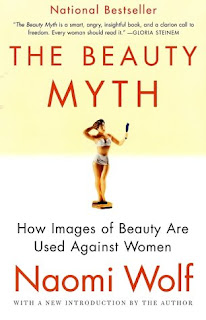
Women buy the magazines because they aspire to be like the models, and men read the magazines because they find the women sexually attractive.
I also related to Blumler and Katz Uses and Gratifications theory (1974) which stated that the audience aspires to be like the models featured in magazines, and get a sense of ownership. Readers also admire the women in my magazine, and want to be like them because society has conditioned them to be this way. Women may look to magazines for guidance if they have a lack of self esteem or social success and
http://en.wikipedia.org/wiki/Uses_and_gratifications_theory states and studies the four major areas of need which the media in general seek to gratify: diversion, personal relationships, personal identity and surveillance. To give my magazine a sense of personal identity, I used people of a similar age to the target audience throughout my product, so that they can relate to them. Readers may have suffered from some of the problems that my celebrities have battled through and can therefore relate to them, which is a common convention of a music magazine. Readers who are into chart music buy the magazine because it helps them to express their identity, and this makes them feel like part of a social group. However, I challenged this theory because I have used a ‘normal’ sized model. This means that I have not presented the kind of image that is idealized by a patriarchal society so this will allow more women to relate to the magazine, which will increase its circulation.
Since my magazine is based on chart music, people would be more likely to buy the magazine if their favorite celebrity featured as a hook on the cover. This is one of the reasons I have ‘name dropped’ a lot of celebrities on the cover. I have also used an informal tone throughout my article so that it appears to be more laid back and targets a younger, working class audience. I added hooks on the cover relating to downloading music as they are a very popular, well priced way of getting music. I decided to use red and black as my main colours as they are not stereotypically feminine colours and this would therefore help to attract all types of women. At £2 my magazine is also very reasonably priced as it is issued monthly, this will help to attract a wider audience. I also included competitions to win concert tickets as this gives readers an input and gives them a sense of ownership which encourages them to buy the magazine.
Once I had created my magazine, I handed out thirty copies of my final product to people in my target audience. I decided to do this so that I could get an honest opinion from the public on my magazine. I think this helped me when I reviewed my product because I edited certain features to make sure it suited the public’s opinions. I have included a couple of their comments below:
‘I think your magazine looks very professional and will be able to compete with other magazines on the market. I’ve never seen one like it before so I would definitely buy it; plus it contains loads of different types of music!’
‘I like how your magazine is different; it’s not like all of the gossip magazines that repeat the same stories. It’s unique and I really like it.’
‘I love the colour scheme because it’s not too girly but isn’t manly. The white background makes everything stand out more as well so I think its eye catching. At £2 it’s a bargain as well so I would buy it!’
‘I love your article because its not just telling you about rumours, its genuine honest questions and answers. I think it’s great how Brooke can talk about her past and feel like she doesn’t have to be ashamed. It proves no matter where you come from anything can happen.’
What have you learnt about new technologies from the process of creating this product?
Using Adobe Photoshop, I was able to learn a lot of new skills, for example how to crop photo’s in a smooth motion, so that there were no rough edges.
I also learnt how to alter the lighting to make the photo appear less grey. I achieved this by using the brightness and contrast tool and the curve tool on photo shop. This helps to make the photo brighter and stand out more on the white background. On my front cover and contents page I also used the bevel and emboss, drop shadow and outer shadow tools so that the text would stand out. I think this is effective as it makes the writing jump out of the page, which helps to attract the reader’s attention. This website
http://photoshoptutorials.ws/photoshop-tutorials/general/basics/ contains help on using Photoshop.
I was also able to use the camera and tripods to my advantage as I learnt the best techniques and angles to take photographs at, so that the lighting was of a much higher standard. I also learned how important it was to use a tripod with the digital camera to make sure that the image was not blurred. This helped to make my photos look more professional.
http://malektips.com/digital_portrait_photography_help_and_tips.html was able to give me basic advice for using digital photography.
I learnt that it was better to take a large quantity of photographs so that I would have the option of what ones I did and didn’t want to use. This helped me because it meant I was able to recognise a good, professional looking photo compared to a dull, grey, blurred photograph. Here are some examples of photographs that I decided not to use:
I like this picture, however the white top blended in too much with my white background therefore I decided not to use it.

Originally I was going to use this on my cover; however I decided that the photo looked too dull in colour. I also decided that I didn’t like my models pose as her arms would make it awkward to cut out and she looks uncomfortable.

To exploit Media 2.0 I have also learnt how to create a blog so that anyone can see my project. I decided to add work and drafts to it as I went as well as a combination of texts and images, so that the audience could see the progression I have made whilst creating my magazine. This means that people worldwide are able to comment on my work, not just my teacher and colleagues.
http://www.blogspot.com/ is the website that I used to display my project.
Looking back at your preliminary task, what do you feel you have learnt in the progression from it to the full product?I think that my final product looks a lot more professional than my preliminary task. I think this is because I was able to research magazines already on the market and look at the conventions that they used, before creating my product. Researching also allowed me to target my audience carefully, which meant I could produce something that could compete in the real world to a much larger audience with greater spending power. By re-drafting I have had the opportunity alter the quality of my work which has helped to improve it greatly, as I gained confidence using Adobe Photoshop regularly. I also learnt a lot about how to position text on a front cover because on my preliminary project one of the smaller photos was positioned on top of my main photo, which I think looks very unprofessional. I also learnt that barcodes and price tags should be placed somewhere so that they don’t take over the whole front cover, they should be subtle, which I think mine is. Obviously, one of the main reasons for my work improving is that I had a lot longer to work on this project than I did on my preliminary task that meant I was continuously able to look back over my work and change anything I was unhappy with. Another factor I have improved at is using Adobe Photoshop because I have used a variety of the tools on it to adjust images and add effects to text. In my opinion, I have too much free space on my preliminary cover whereas I learnt not to overcrowd my full product but to add just the right amount of text. My final product had to have broader commercial appeal, and look like it would appear on the shelves of retailers such as WHSmith, as well as smaller businesses, next to magazines such as ‘Q’. Potentially, it could also be available worldwide, and my target audience is vastly larger than my school magazine was.


