 Double Page spread
* I decided to use an article form 'Star' magazine to create my layout.
* I extracted a quote to use for the title as this is a common convention of an article.
* The pink and white text are eye catching and help to attract the readers eye.
* I used a white background for text and a grey one for the overall background so that it made everything stand out.
* I used a larger 'B' to start my article as this is also a common convention.
* I got inspiration fron 'Star' magazine for the header as they use a similar format.

* I decided to use a question and answer format for my article.
* I added a medium shot of my model, and used the 'curves' and 'brightness and contrast' tools on Adobe Photoshop to make the image lighter.
* I also extracted an additional quote to feature in the centre of my article as this is a common convention.
* I cropped the image on Adobe Photoshop.
* I made the questions pink and the answers black so that they would stand out on the page.
*I organised my interview into columns as it is a common convention of an article.
 First Draft Single Page Spread
* I decided to keep a white background to ensure everything stands out.
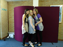
* I added three smaller photographs to make the page look bolder and more eye catching.
*I continued to keep the writing in columns, as this is a common convention.
* I extracted an extra quote to feature in the centre.
* I kept the same page layout as the previous page.

Final Single Page Spread
* I changed the photograph on the bottom of the page as the previous one is a lower quality, and the lighting is very bad.
The one I have changed looks brighter and more professional.
*I altered the brightness and contrast on the image at the top of the page to make the lighting better.
* I wrote a name at the bottom of the article as this is a common convention of an interview.
* I also rounded off the article by stating what my celebrity is currently doing.


No comments:
Post a Comment