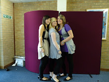
I decided to ask a friend to model for my photographs as I wanted to have a range of different shots. For some of my photographs we went to the Newcastle/Gateshead Quayside to capture some different poses, on different backgrounds. However, I chose to use a photo against a plain background for my front cover, so that it would be easier to cut out. I am going to use my photos for my cover, contents page and four page article. As the majority of magazines only have one person on the cover I decided to use this convention when I created my own. After studying all of the photographs that I had took, I decided to choose which ones i definately did not want to use.

This photo is from the first set of photographs that I took, however I decided not to use them as the white t-shirt did not stand out on my white background.

Although I like the background of this photograph there is too much of a shadow on the model, therefore I decided not to use it as it was also unclear.

I decided this white background did not compliment my models complexion and the pose wasn't very good so this is another photo I decided not to use.

I was going to use a photograph of my model sitting down for my article however it was difficult to capture a good background and on the photo my model is laughing too much and is windswept, so I choose not to use this one either.
 Originally, this was going to be the photograph that I used on my cover, however after analysing and trying to adjust it I decided that I didn't like the quality of the photo. I attempted to alter the brightness and contrast and I used the curves tool to make the photo appear less grey. In the end I decided I didn't like how my model was positioned or the bad lighting.
 After taking another set of photographs I decided to use this one on my front cover. However, I decided that if I was going to use it on my cover I would have to drop it and alter the brightness and contrast using photoshop.
  This is the final image once I had manipulated it. I think it looks more professional because the lighting is much better and the photo is cropped and ready to be placed onto my front cover.

No comments:
Post a Comment