Front Cover
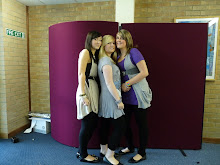
 First Draft
I decided to re draft this front cover because:
~ The photo is very grey and dull.
~ The background also looked grey.
~ I thought the pink colour scheme was too harsh and would only attract women who were classed stereotypically as 'girly'.
~ It is difficult to read the text down the left hand side.

Second Draft
~ I used the same colour scheme as 'VIBE' magazine.
~ I think the red will attract a wider audience.
~ Free CD helps to draw attention to potential buyers, this is a common convention of a magazine.
~ However, the image and background still looked grey.
Third Draft

~ I used the brightness and contrast tool on Adobe Photoshop to make the image brighter.
~ I also changed the background to ensure it was white.
~ To make some of my text stand out I added a drop shadow on Adobe Photoshop to make it look like it is jumping out of the page.
~ To make my title stand out I used the bevel and emboss tool, and also added the stroke effect to make it more eye catching and bold.
~ I added a discrete outer glow to the text on the left hand side to make it stand out against my models skin.
~ The price for my magazine is £2 as this is the amount my target audience said they were willing to pay in my questionnaire.
~ Barcode positioned in a discrete place so it does not draw attention from the cover.
Final Cover

After attempting to edit the previous photograph a number of times I decided to use a different one.
~ I think this one looks more professional and is of a much higher quality.
~ I altered the brightness and contrast using Adobe Photoshop to make the photo brighter, and also used the curves tool to make the lighting better.
~ I think the colours that my model is wearing help to compliment my cover.
~ In relation to Marjorie Ferguson's theory, my models pose is
a 'chocolate box' as she is looking into the camera, half smiling with lips together.
~ I think this cover looks professional as I have used common conventions of magazines already on the market.
~ I kept the same colour scheme as my 'house cover' 'VIBE', and used white for a small amount of text.
~ I think my magazine would attract the attention of a broad demograph.


No comments:
Post a Comment